Exploring HTML Containers - Part 1: Introduction to HTML Containers#
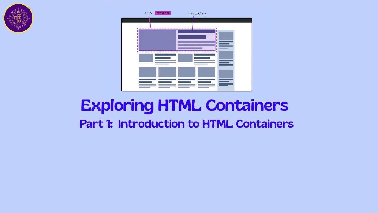
What are different containers in HTML?#
In HTML and CSS, a “container” tag isn’t a special keyword — it’s a general term used to describe any element that wraps or groups other elements. They don’t of any size of their own, but the size of all the elements put inside the container is their size.
There are several common container tags, each with its own semantic meaning and typical use cases. Here’s a breakdown of the most important ones:
🧱 1. <div> – Generic Container#
- Use: For grouping elements purely for styling or scripting.
- Display (default):
block - Semantics: None (non-semantic)
- Typical use: Layout blocks, wrappers, utility containers.
<div class="container">
  <h1>Welcome</h1>
  <p>This is a div container.</p>
</div>
✅ Most commonly used container tag.
📰 2. <section> – Section of Content#
- Use: Groups related content with a heading.
- Display:
block - Semantics: Yes — indicates a standalone section.
- Typical use: Article sections, feature blocks, documentation topics.
<section>
  <h2>Features</h2>
  <p>Some feature content here.</p>
</section>
✅ Use when content has a logical heading and topic.
📝 3. <article> – Independent Article Content#
- Use: For self-contained content that could be syndicated or reused.
- Semantics: Yes
- Typical use: Blog post, news article, forum post.
<article>
  <h2>Blog Title</h2>
  <p>Blog content...</p>
</article>
✅ Use when the content can stand on its own.
📦 4. <main> – Main Content Area#
- Use: Main unique content of a page (only one per page).
- Semantics: Yes
- Typical use: Core article area, excluding sidebars/nav/footers.
<main>
  <h1>Welcome</h1>
  <p>This is the main content.</p>
</main>
✅ Helps screen readers skip to main content.
🎛️ 5. <aside> – Side Content#
- Use: For tangential or complementary content (ads, tips, related links).
- Semantics: Yes
- Typical use: Sidebars, related articles, pull quotes.
<aside>
  <p>Did you know? ...</p>
</aside>
✅ Avoid using for unrelated content.
🧭 6. <nav> – Navigation Links#
- Use: Wraps major navigation links.
- Semantics: Yes
- Typical use: Menus, headers, sidebars with links.
<nav>
  <a href="/">Home</a>
  <a href="/about">About</a>
</nav>
✅ Screen readers recognize it as a navigation area.
📜 7. <header> and <footer> – Top/Bottom Section Wrappers#
- Use: Contain intro/outro content.
- Semantics: Yes
- Typical use: Inside a page or inside an
<article>
<header>
  <h1>My Website</h1>
</header>

<footer>
  <p>© 2025 All rights reserved.</p>
</footer>
✅ Can be used multiple times (e.g., per section or article).
🧃 8. <span> – Inline Container#
- Use: Group inline content (small sections of text) for styling.
- Display:
inline - Semantics: No
- Typical use: Style part of a sentence.
<p>This is <span class="highlight">important</span> text.</p>
✅ Useful for small inline formatting.
Summary Table#
| Tag | Semantic? | Default Display | Best Use Case |
|---|---|---|---|
div | ❌ No | block | Generic layout grouping |
section | ✅ Yes | block | Topical grouping with headings |
article | ✅ Yes | block | Reusable/self-contained content |
main | ✅ Yes | block | Main content of the page |
aside | ✅ Yes | block | Sidebar/complementary info |
nav | ✅ Yes | block | Navigation links |
header | ✅ Yes | block | Introductory content |
footer | ✅ Yes | block | Closing content |
span | ❌ No | inline | Inline text styling |
Why use display: table and related styles instead of HTML <table>?#
Reasons to use table layout with CSS:#
| Reason | Explanation |
|---|---|
| ✅ Semantic HTML | HTML <table> should be used only for tabular data, not for layout. Using div + CSS keeps your HTML semantic and accessible. |
| ✅ Responsive Design | It’s easier to make layouts responsive when using CSS. HTML tables are rigid and hard to control on small screens. |
| ✅ More Styling Control | With CSS-based layouts, you have full control over spacing, alignment, media queries, etc. |
| ✅ Cleaner Separation of Content and Layout | You don’t mix data structure with design intent. That’s modern web practice. |
Example:#
<div class="table">
  <div class="row">
    <div class="cell">Name</div>
    <div class="cell">John</div>
  </div>
  <div class="row">
    <div class="cell">Age</div>
    <div class="cell">30</div>
  </div>
</div>
.table {
  display: table;
}
.row {
  display: table-row;
}
.cell {
  display: table-cell;
  padding: 10px;
  border: 1px solid gray;
}
This creates a layout that looks like a table but uses <div> and CSS instead of HTML <table> elements.
What is displya: grid (CSS grid layout)#
CSS Grid Layout is a powerful layout system in CSS designed to help web developers create complex and responsive web layouts easily and efficiently. It allows you to create two-dimensional layouts—both rows and columns—without using floats or positioning tricks.
🔷 What is CSS Grid Layout?#
CSS Grid is a layout model that lets you divide a web page into major regions or define the relationship in terms of size, position, and layer between parts of a control built from HTML primitives.
Think of it as turning your container into a grid of cells, where you can place child elements precisely in any cell or span across multiple cells.
🔧 How CSS Grid Works#
1. Create a Grid Container#
You define a grid by setting display: grid on a container.
.container {
  display: grid;
}
2. Define Rows and Columns#
Use grid-template-columns and grid-template-rows to define the structure.
.container {
  display: grid;
  grid-template-columns: 200px 1fr 1fr;
  grid-template-rows: auto auto;
}
This example creates:
- 3 columns: one fixed (200px) and two flexible (
1freach) - 2 rows with automatic height
3. Place Grid Items#
Each direct child of the grid container becomes a grid item, and you can control its position using:
.item1 {
  grid-column-start: 1;
  grid-column-end: 3;
  grid-row-start: 1;
  grid-row-end: 2;
}
Or use shorthand:
.item1 {
  grid-area: 1 / 1 / 2 / 3; /* row-start / column-start / row-end / column-end */
}
✅ Key Features of CSS Grid#
| Feature | Description |
|---|---|
display: grid | Activates grid layout on a container |
grid-template-columns, grid-template-rows | Defines columns and rows |
grid-column, grid-row | Places items in specific grid areas |
fr unit | Fractional unit for flexible layouts |
grid-gap / gap | Space between rows and columns |
grid-template-areas | Name areas and place items semantically |
🎯 Use Cases of CSS Grid#
- Page Layouts: Headers, sidebars, footers, main content
- Dashboards: Control panels with resizable sections
- Galleries: Image grids with consistent spacing
- Forms: Neatly aligned labels and inputs
🆚 Flexbox vs Grid#
| Feature | Flexbox | Grid |
|---|---|---|
| Direction | 1D (row or column) | 2D (row and column) |
| Use Case | Alignment, navigation bars | Layouts, full-page sections |
| Item Placement | Sequential | Absolute (by coordinates) |
🧠 Visualization Example#
.container {
  display: grid;
  grid-template-columns: repeat(3, 1fr);
  grid-template-rows: auto;
  gap: 10px;
}
HTML:
<div class="container">
  <div class="box">1</div>
  <div class="box">2</div>
  <div class="box">3</div>
</div>
This creates a 3-column layout with equal widths and 10px gaps between boxes.
Comments: